Sketch For a Efficient News Reading App
I have always been thinking about a efficient design for people to read news.
For one thing, excessive information has been one of the most wide-spread and significant problem people are faced with.
For the other, I am a person who care much about efficiency. With a limited amount time, we can not extend the whole length of our time but to make the best use of useful time.
What’s more, reading is an important habit in my daily life. (Although it was always sacrificed for other insignificant things)
Get back to the point.
What should a efficient-reading app looks like?
In my opinion, there are two important rules/goals for us to follow when we are designing such a application.
- Efficient information organization. (For instance, important/highly-used information should be displayed in high priority)
- Abundant, clear, fast user interactions. (For instance, a key should appear when and only when I am in front of a door)
Here is my solution for one simple case: news reading.
This app was originally designed for a RSS reading application, while I did not have enough time to finish the development. But I think some ideas behind this design is important and inspiring for design in other application.
Overview
This app is made up of only two main pages: article list page and article content page (I also call it “article consumption page”)
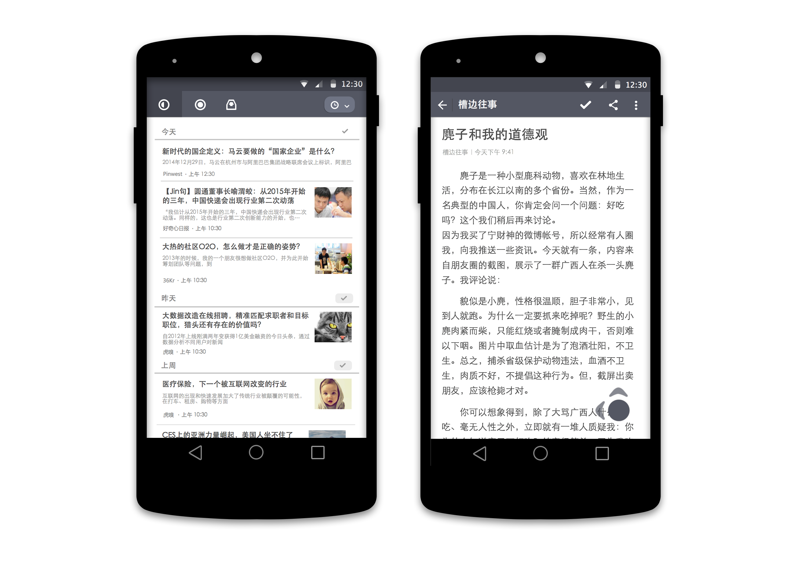
Then I will explain how I apply two fundamental rules I mentioned above in my design.
Information Organization
Let me take the article list page as an example. In this page, there is no any decorative, complex or useless information. Every information, from icons to titles to images, have clear and direct meaning.
Before designing this page, I wrote down all necessary information that might appear in this page. And then arranged them according to their content-importance, appearing-frequence and content length/size.
After doing this preparation, I can evaluate importance for every information and design it’s appropriate appearance. For each design entity, there are several important characteristics which influence it’s “weight” in information structure: position, size, color, weight(for fonts).
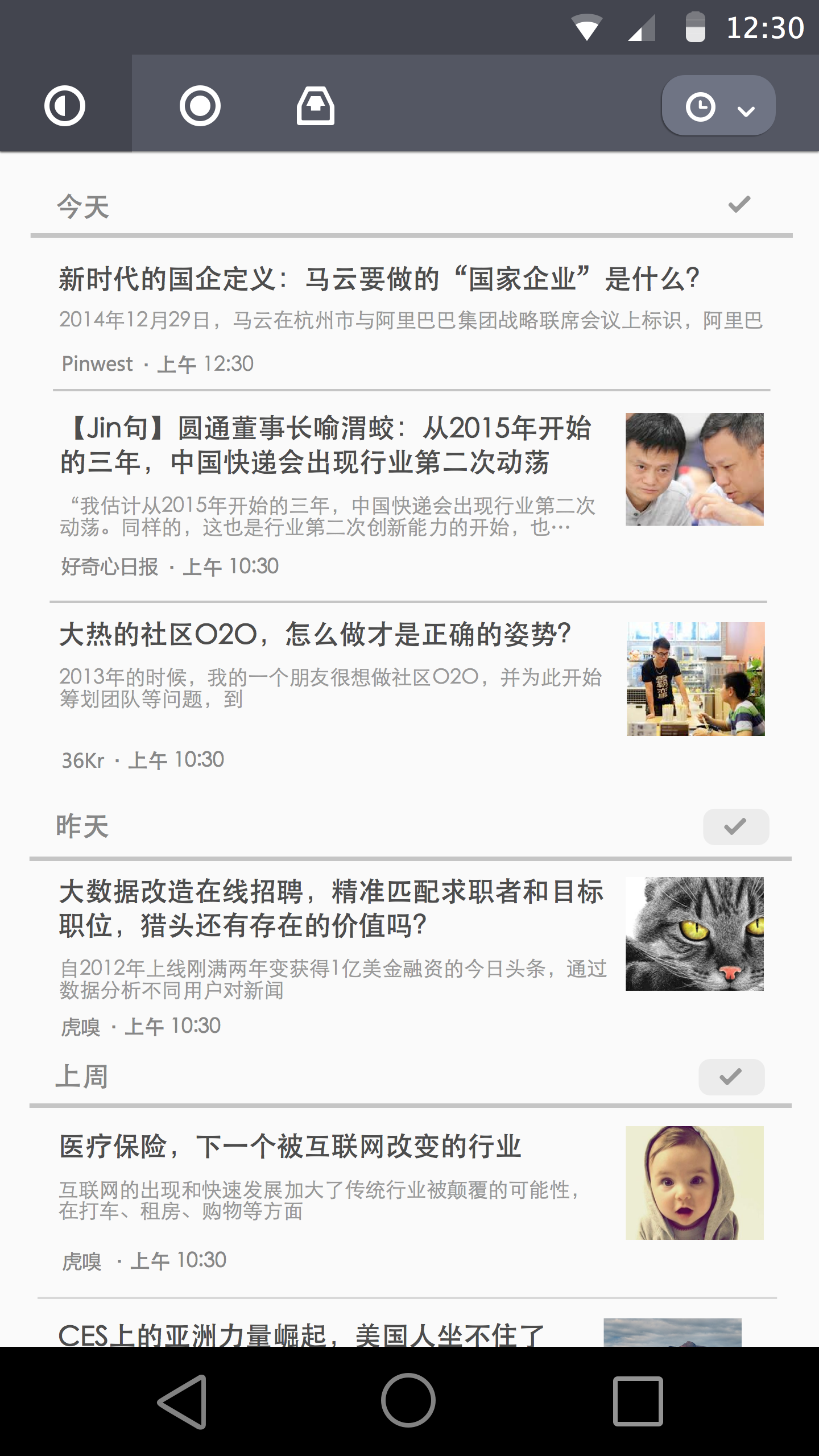
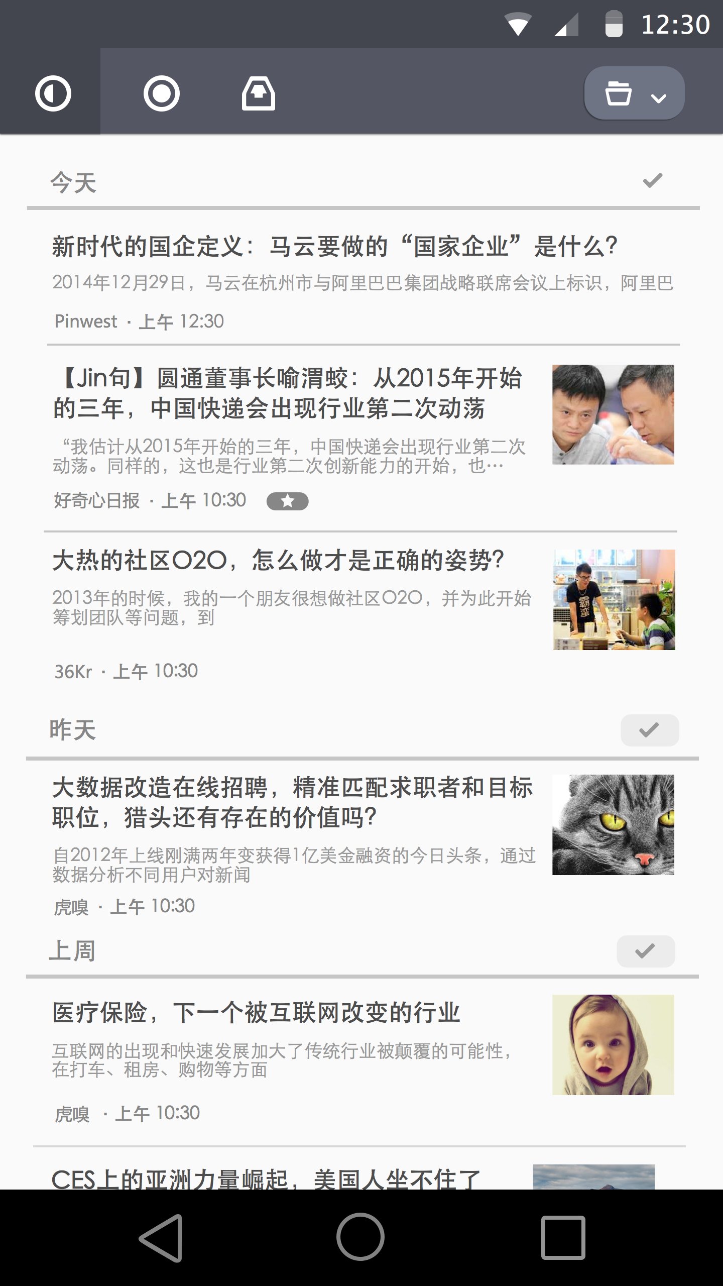
Information in this page are organized in a hierarchy structure:
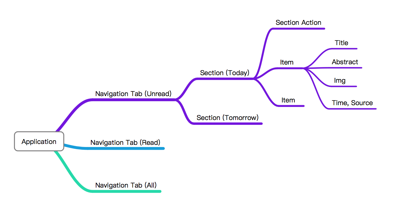
After making this information structure, we can organize information into specific section/layout. Then, in specific section, information are arranged according to their “weight”
As you can notice, the only decorative effect used in this design is shadow. Shadow is one of the fundamental effect for idendifying depth for each layer. In addition, it has little influence on information structure.
Same rules are also followed by article page:
In this page, information are organized according to their weight.
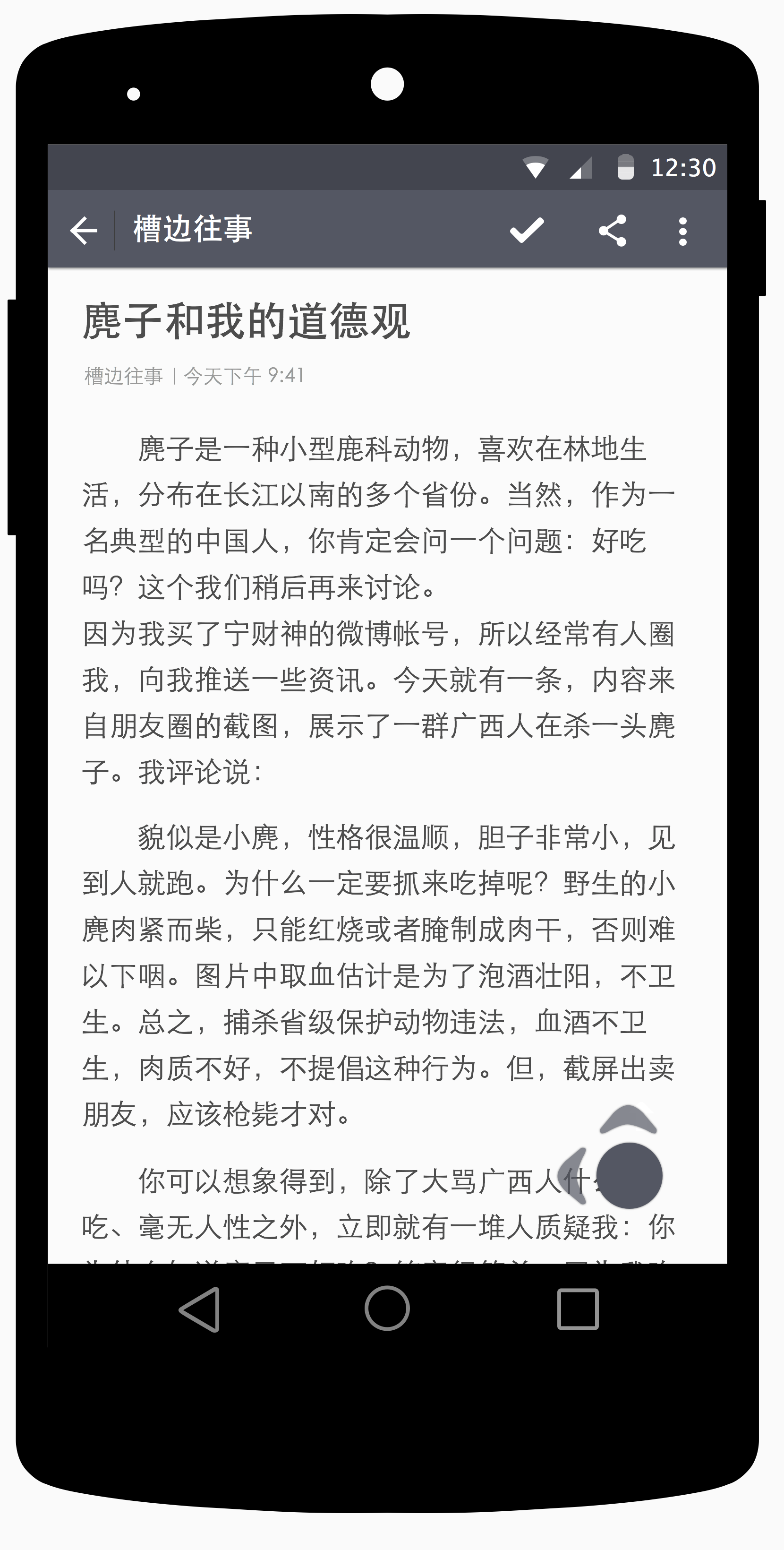
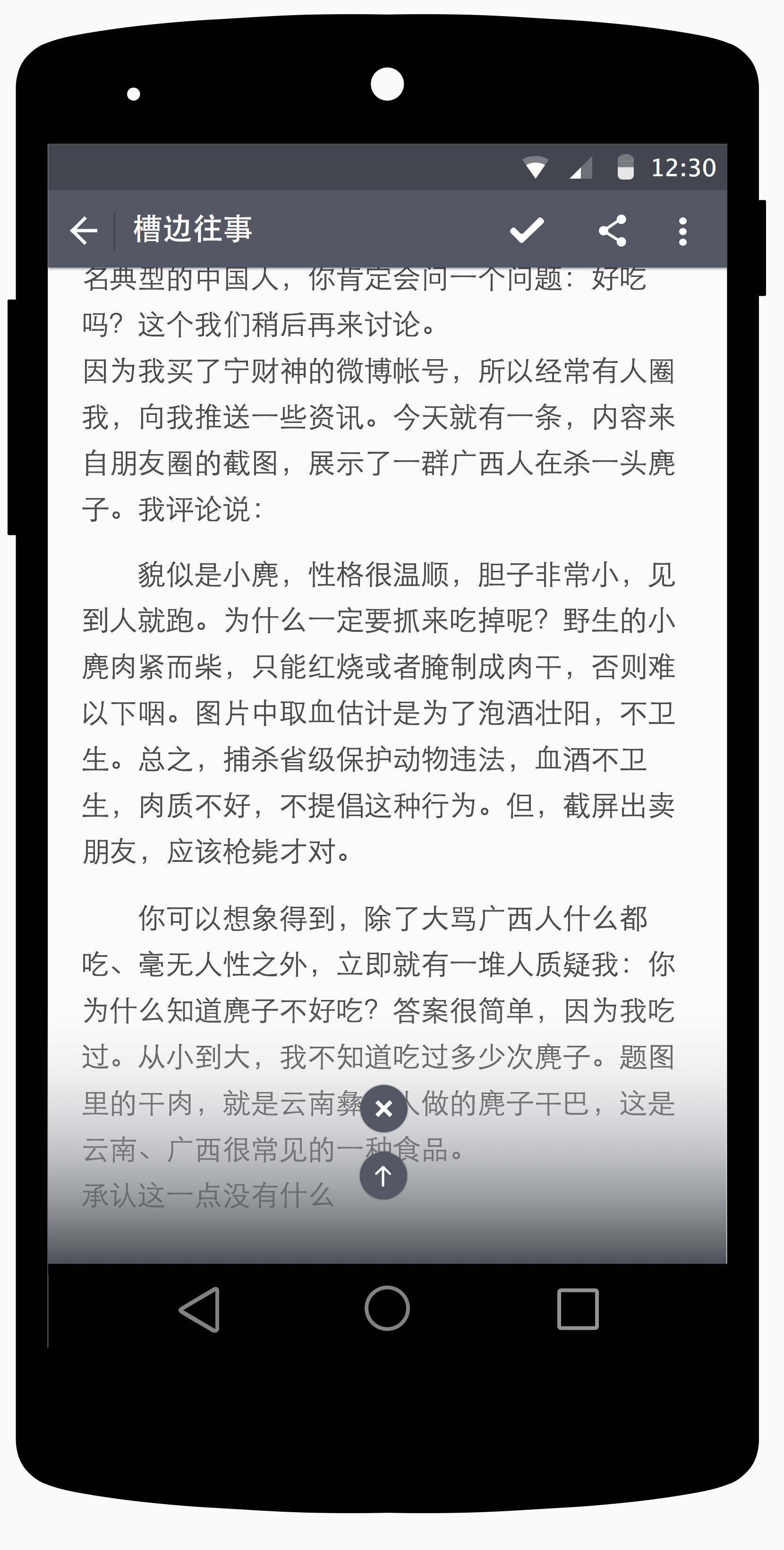
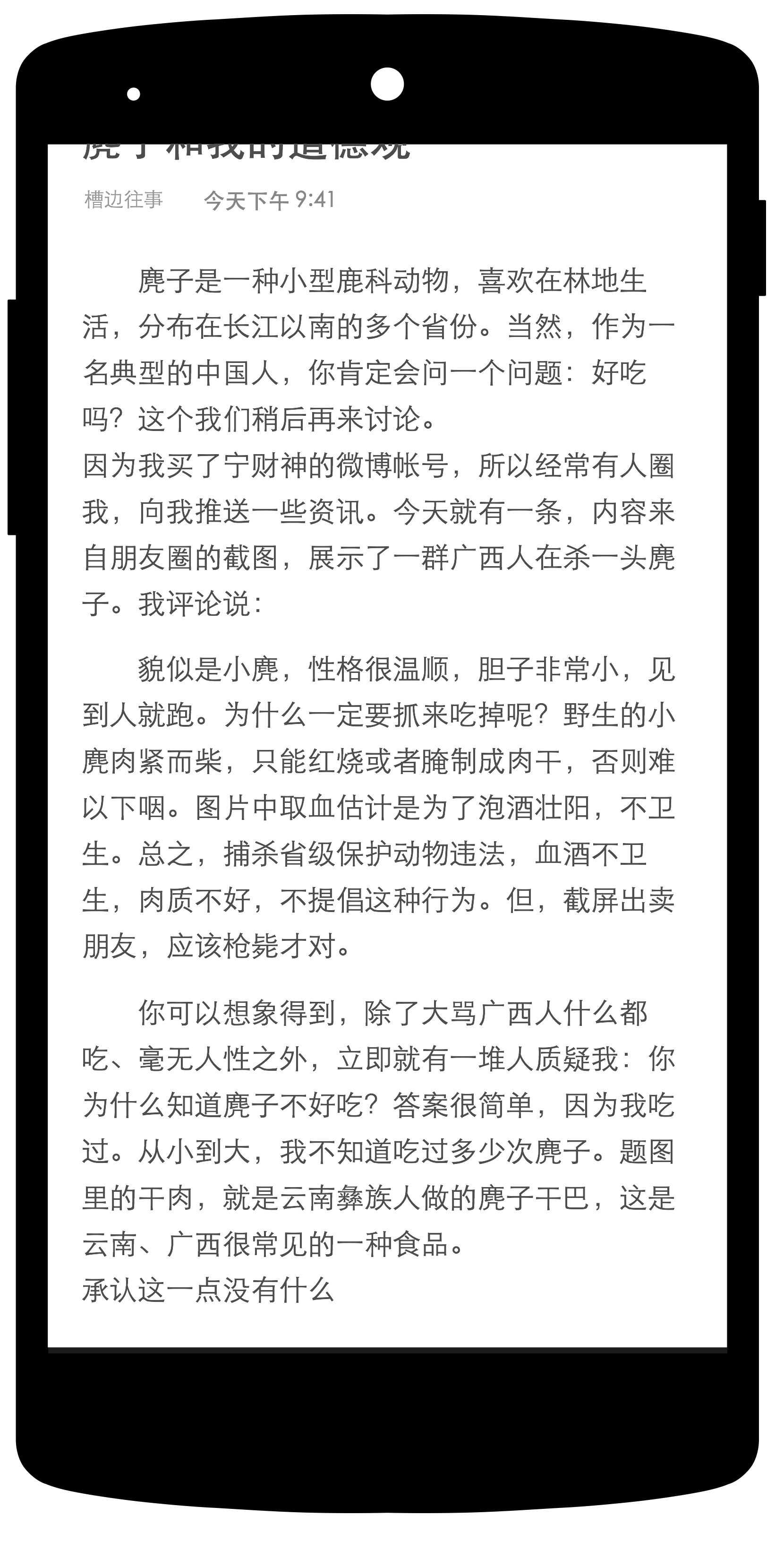
Apparently, article content is the heaviest information in this page. When this page is scrolled and navigation bar will disappear. I made full use of translucent mode in mobile device, this mode makes the whole page immersive.
Efficient User Interaction
1. Easy way to find useful information
Because of the efficient organization of information, users can find useful information in a short time: the most useful information is placed in the most noticable position with the most noticable style (Big size, bold font).
2. Easy way to accomplish some operations
There is always a contradiction between interaction instruction and simplicity/clearity of the design. If you want to tell users “you can do this by clicking this button”, you have to make extra visual effort on this button.
While considering the user base of this application (people of high knowledge level and mobile device interaction experience). I make many easy-to-understand interaction invisible. While users can learn these interactions easily after their first useage.
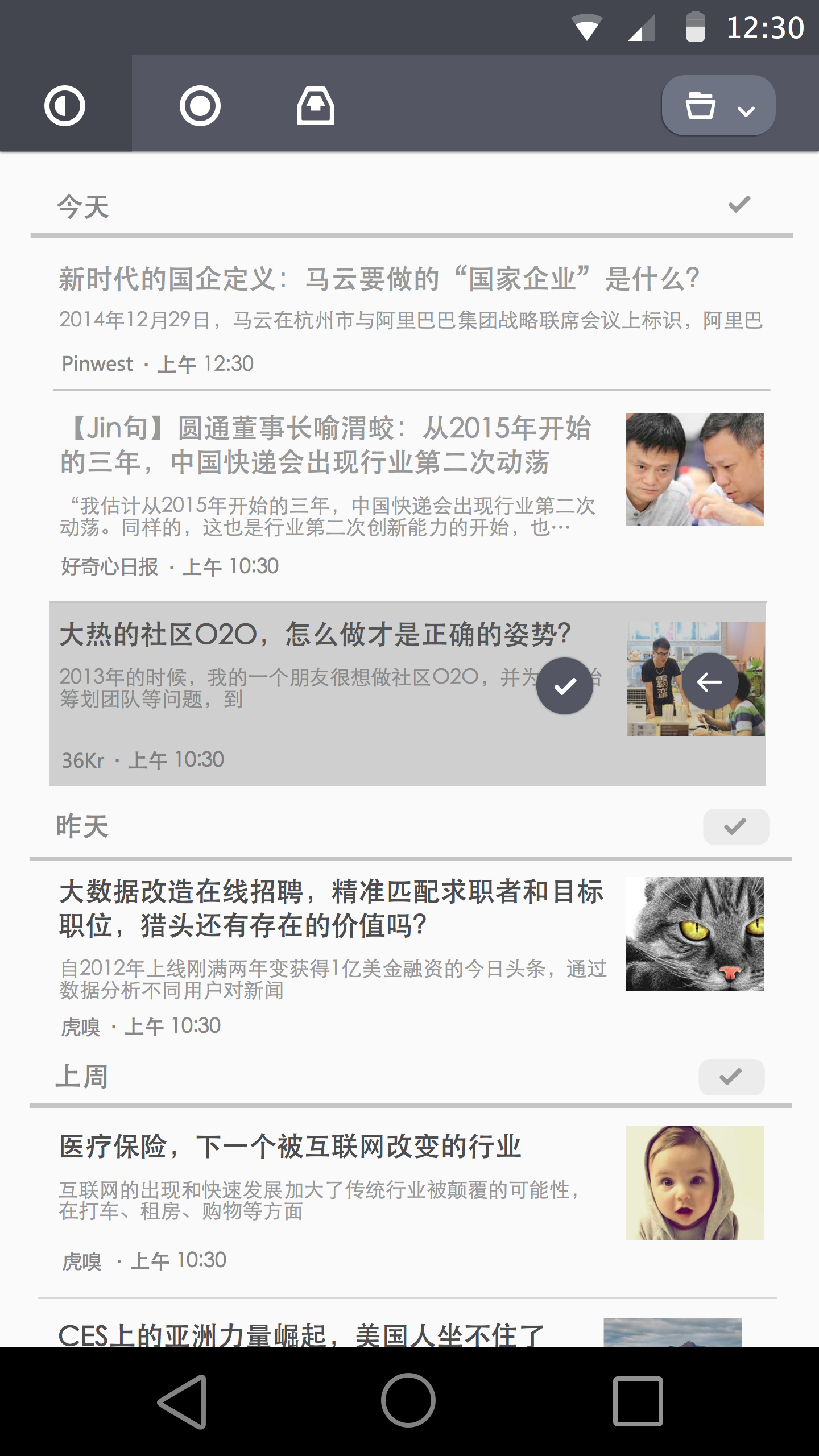
For example, fast operation for marking a article read is accomplished by swiping the article item left. There will be both visual and physical instructions during their operation: ticking icon will appear when user swipe left to a distance; the device will vibrate slightly when “read” operation is accomplished.
There is similar interaction in article page:
Users can swipe up to leave current article page when they are at bottom of the article. Without this interaction, they have to click on the left corner of this page to close current page.
